BELLA TRISTE #67
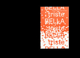
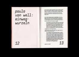
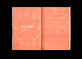
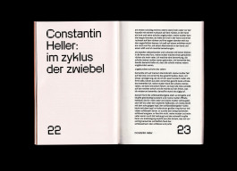
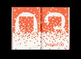
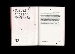
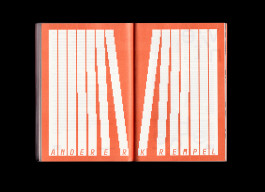
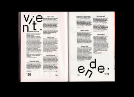
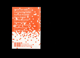
Since the summer issue 2023, we had been lucky enough to design BELLA triste, a magazine for young literature from Hildesheim. Working closely with the editorial team, we were first of all asked to tailor a new typographic dress for BELLA. The basis of our redesign is a new, more compact format and a simple layout with a fixed text typeface. In our redesign, it was important to us to first of all focus on the texts and invite people to read them thanks to good legibility and high-quality paper. At the same time, the magazine should of course also be fun to look at beyond its content. In addition to the consistent basic layout, the concept therefore includes changing the display fonts (meaning the more playful and experimental fonts for headlines) from issue to issue. We develop new design elements from them for each issue. This allows us to combine typography and illustration, pick up on the tone and mood of the texts and playfully emphasise them with our own means. Together with the changing special colour, this gives each BELLA issue its own visual language and still works well in a growing series.
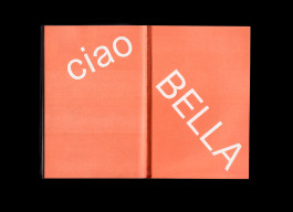
And since #67 at the latest, the motto has been »Collect them all!«, because the covers can be put together to form a continuous BELLA cover puzzle!
BELLA triste is published three times a year. Click here for issues 0 #68 and 0 #69.
Client: BELLA triste
Year: 2023