CHANGING CITIES REDESIGN
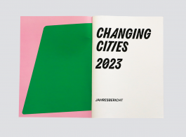
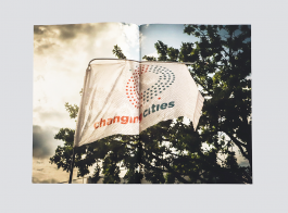
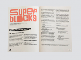
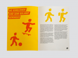
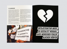
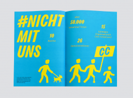
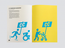
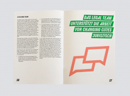
Together with the Berlin-based association Changing Cities e.V., we designed a new visual identity. It needed to be able to cover a lot of things: It should graphically reflect the loud and courageous commitment to the mobility transition and more liveable cities, be inviting and easy to use for the office team as well as for external designers and the diverse group of volunteers. It should make everything that has Changing Cities in it (e.g. campaigns such as the 0 Kiezblocks or the 0 Schulstraßen) look like Changing Cities and give connected initiatives the opportunity to mark their affiliation more easily, but at the same time not constrict and »smooth out.«
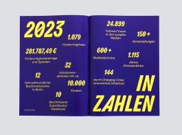
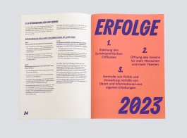
Even after completing the project, we are still having a lot of fun coming up with new ideas for applications within this design framework and we are really impressed with what is being created from this toolbox – if that's not a good sign... In addition to the logo, the main components of the design are a custom font family and an extensive set of icons as well as a colorful palette that also incorporates previously existing campaign colors. Templates (some more complex, such as the annual report, others less complex, such as social media templates or print applications in Google Docs and Canva) are intended to make work easier for everyone involved.
Click here for the 0 detailed design manual.
Client: Changing Cities
Year: 2024


