NEUE KRAMER GROTESK
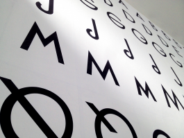
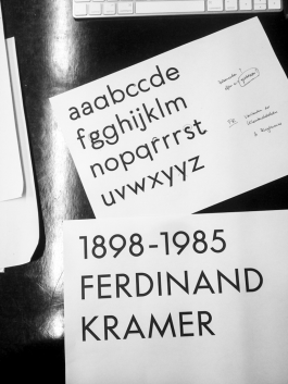
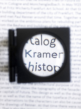
Our first collaboratively designed font family was the result of the fact that the reproduction of a certain font sketch had captured our attention in the relevant specialist literature. This sketch was repeatedly attributed to the architect Ferdinand Kramer (Neues Frankfurt), but the capital letters shown on it looked suspiciously similar to those of Paul Renner's Futura (published in Frankfurt in 1927). No great expertise was needed to recognise a preliminary study for Futura in the so-called »Kramer Grotesk« – the two designers knew each other and were in contact, so it is quite imaginable that a design by Renner ended up in Kramer's drawer.
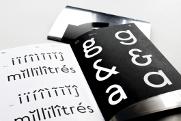
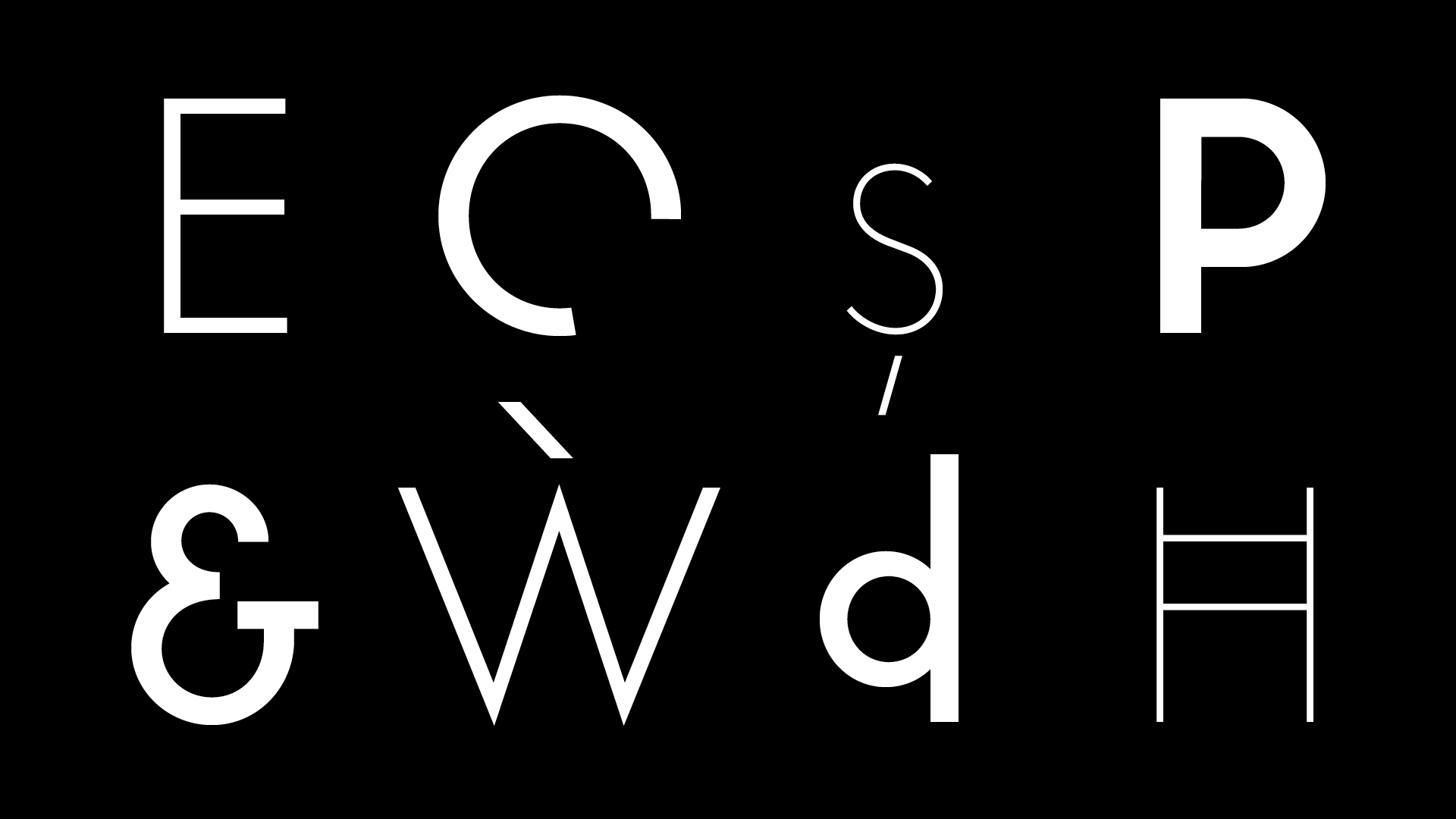
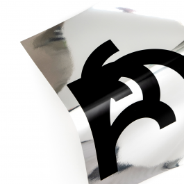
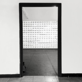
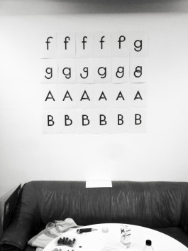
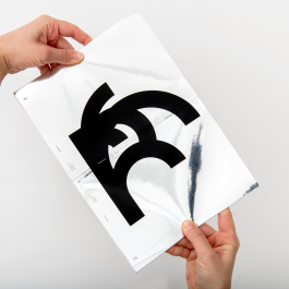
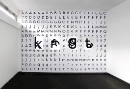
Authorship or not, with the »Neue Kramer Grotesk« we tackled the revival of a font that had never existed (like this). Based on that sketch, we first drew uppercase letters, then lowercase letters, several weights, a text family and a display family plus several sets of alternative glyphs for the display weights. These letter experiments were based on Renner's extremely constructed forms of the »Ur-Futura« – but in contrast to these (designed with a ruler and compass on the drawing board in the 1920s), they were developed from the architecture of the letters so to speak, their skeleton. Instead of picking up on mechanical printing like its historical model (in contrast to handwriting), the Neue Kramer Grotesk works with digital tools, becomes more fluid and is also reminiscent of the stills of an animation in its static alternative forms.
Self-initiated project
Year: 2017 until today